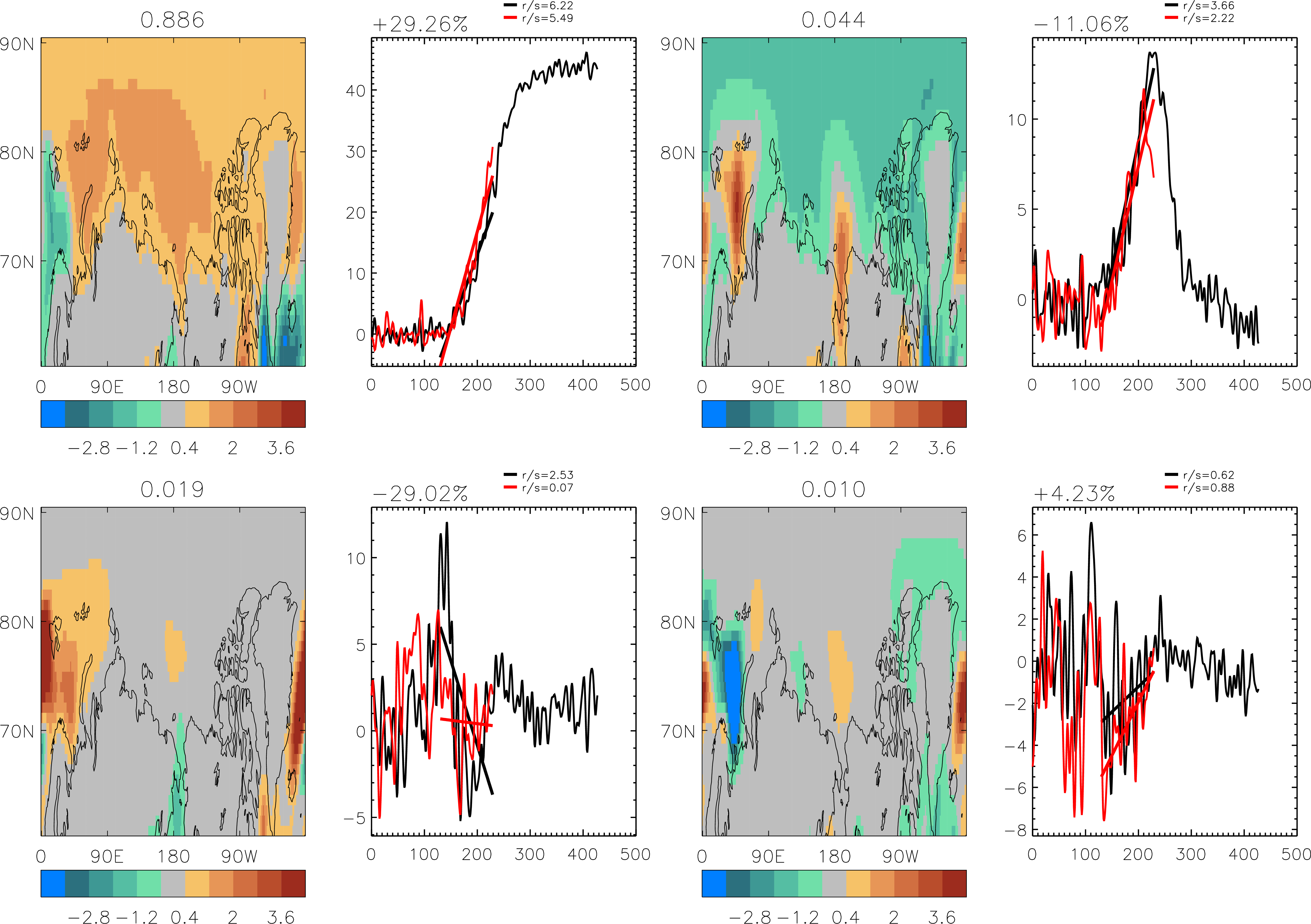
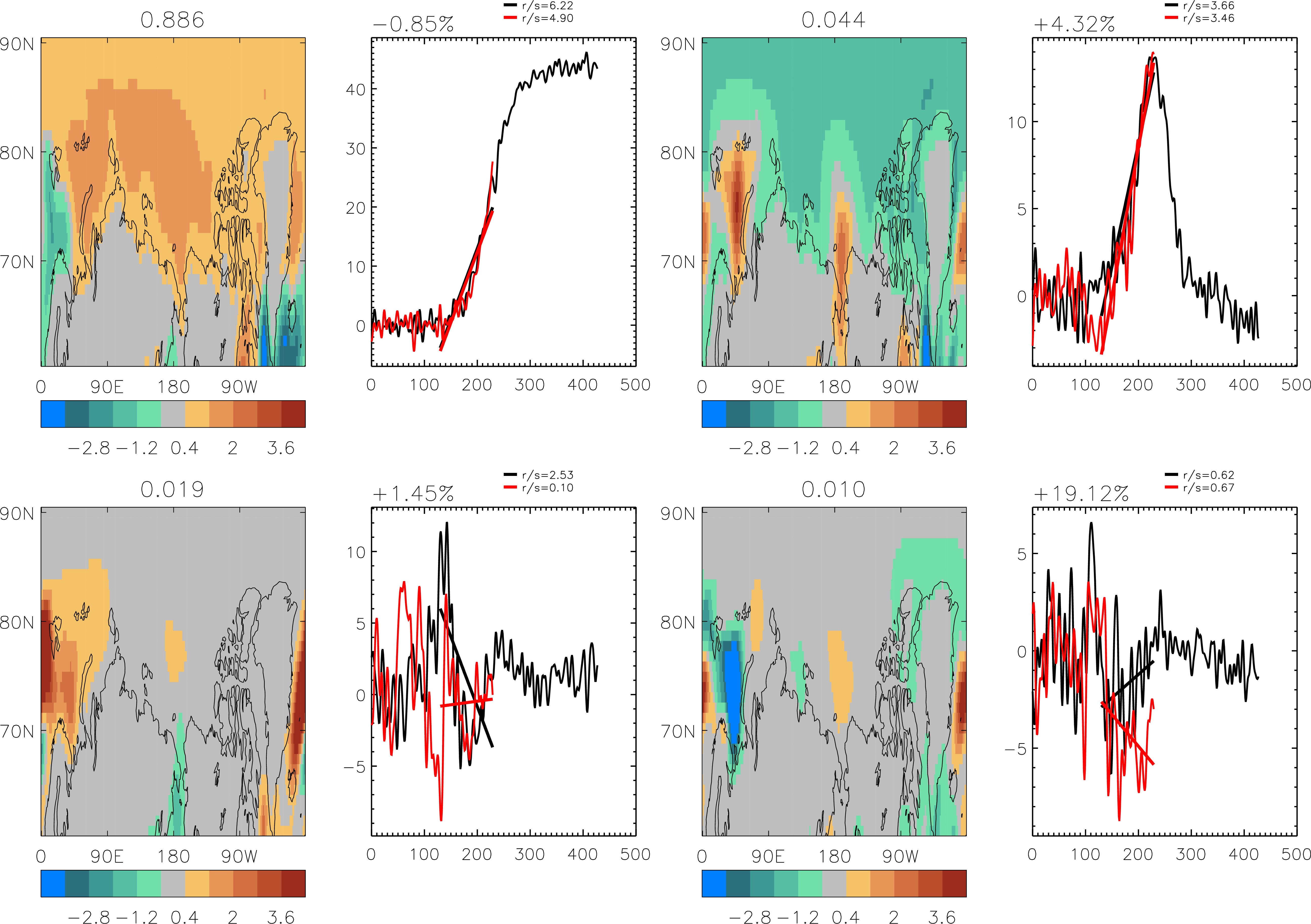
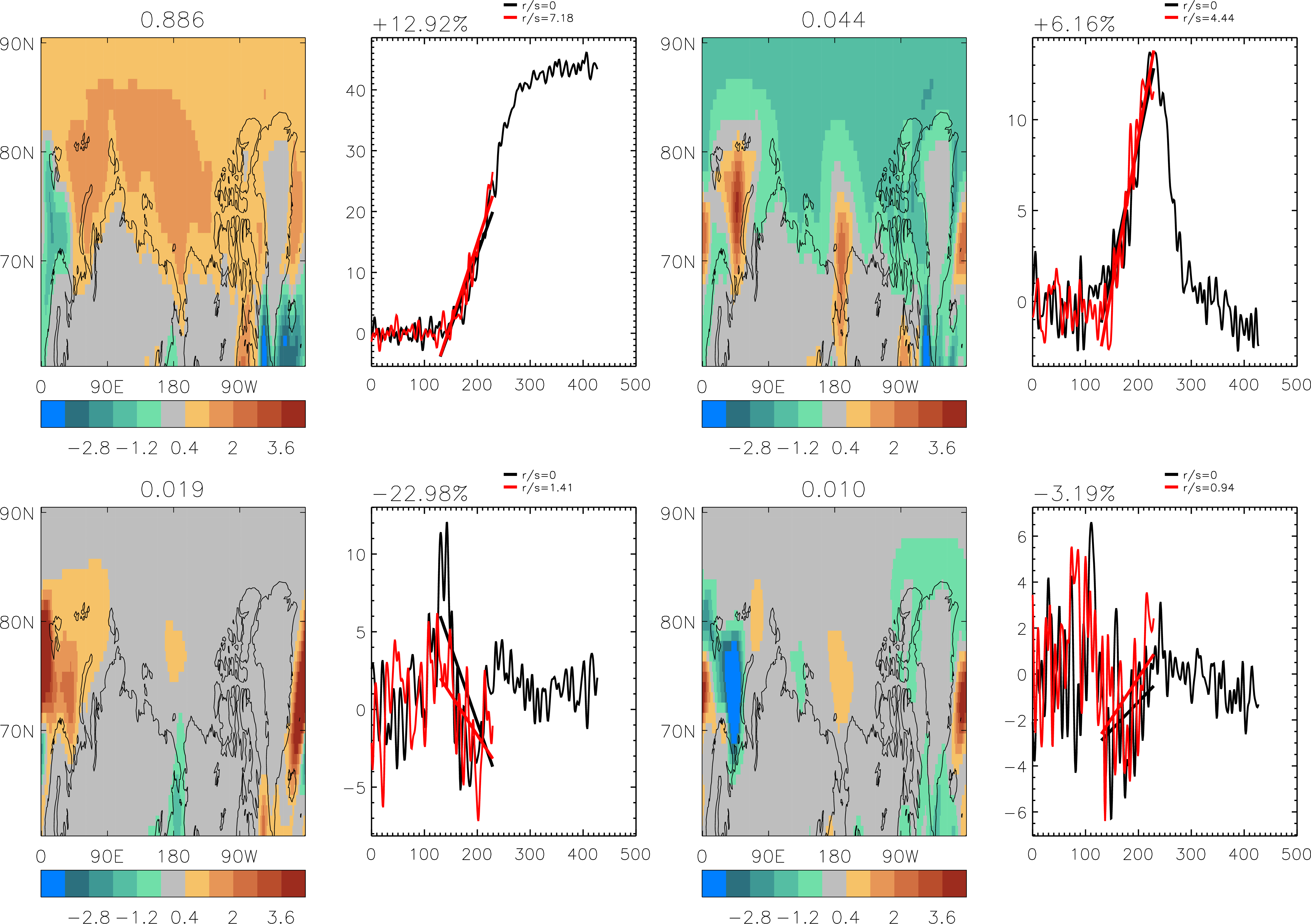
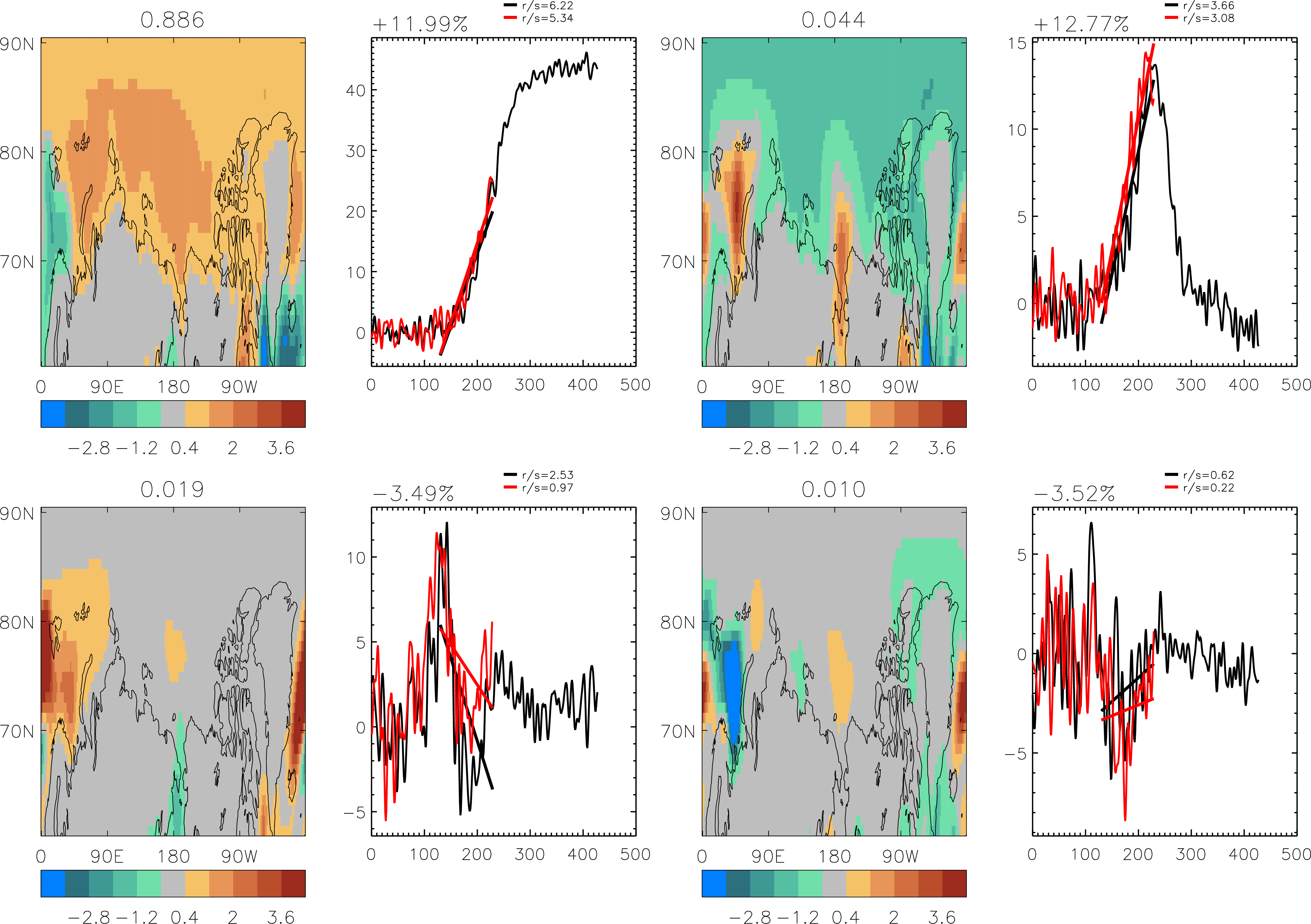
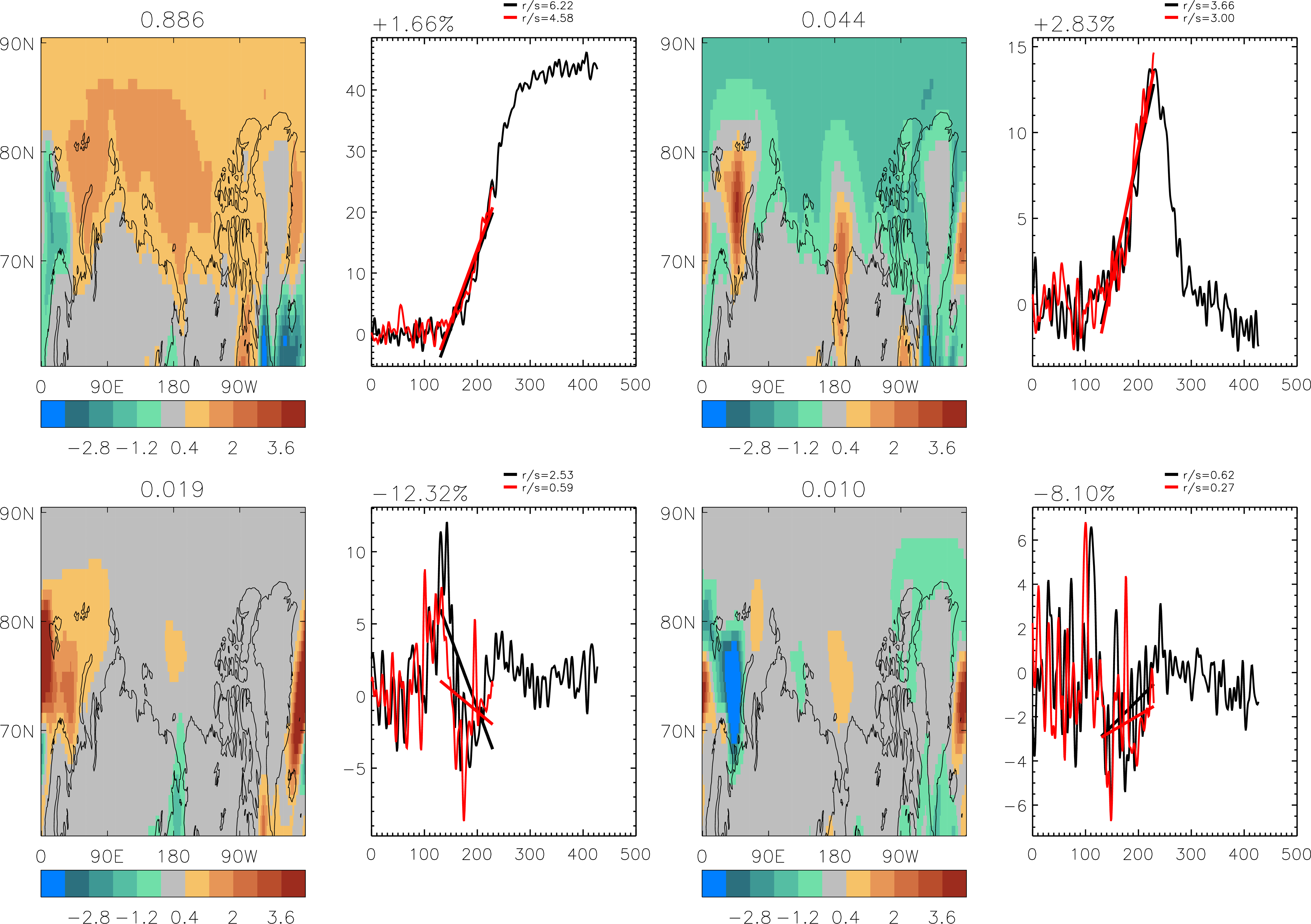
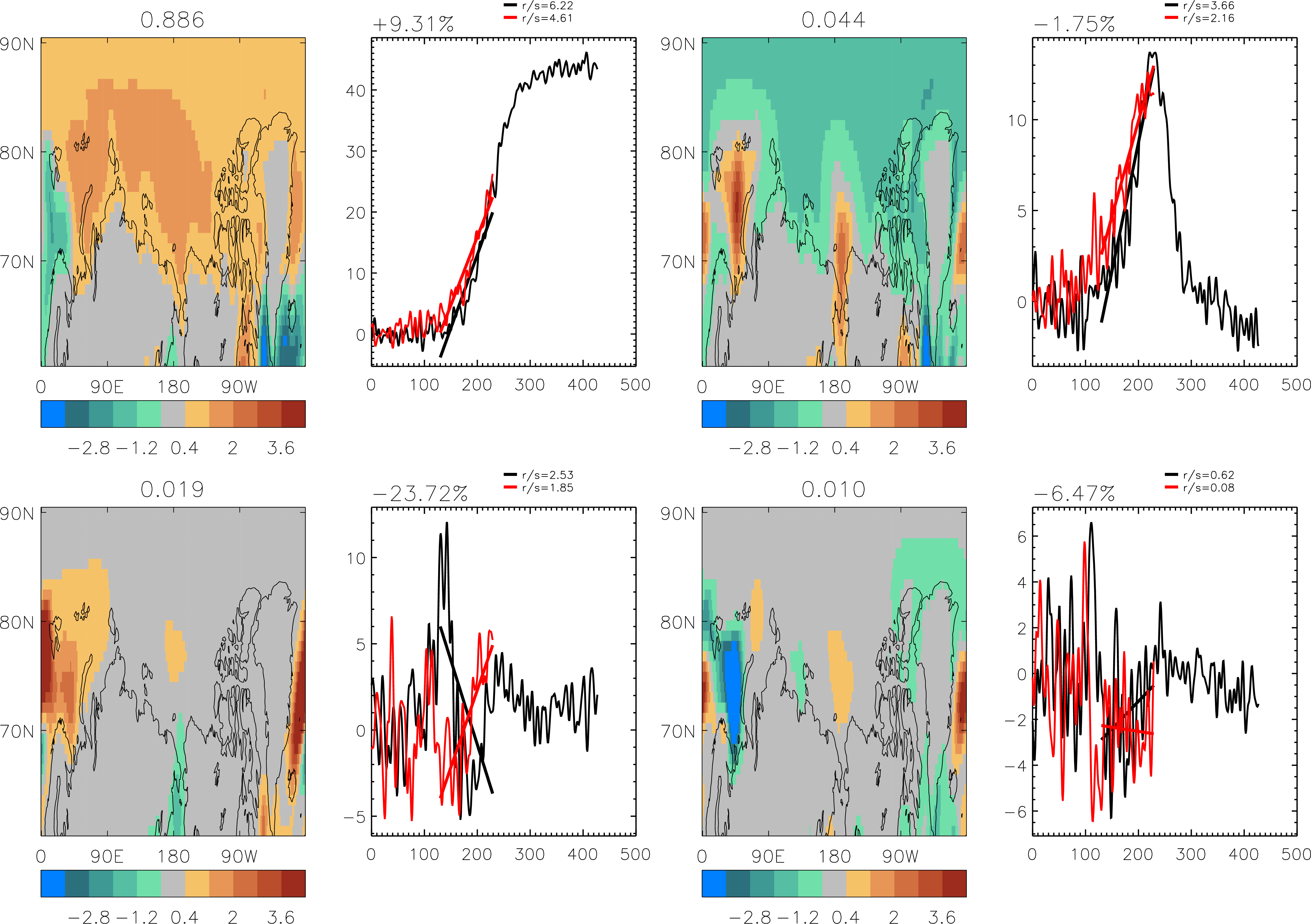
EOFs 1-4 for the Arctic region
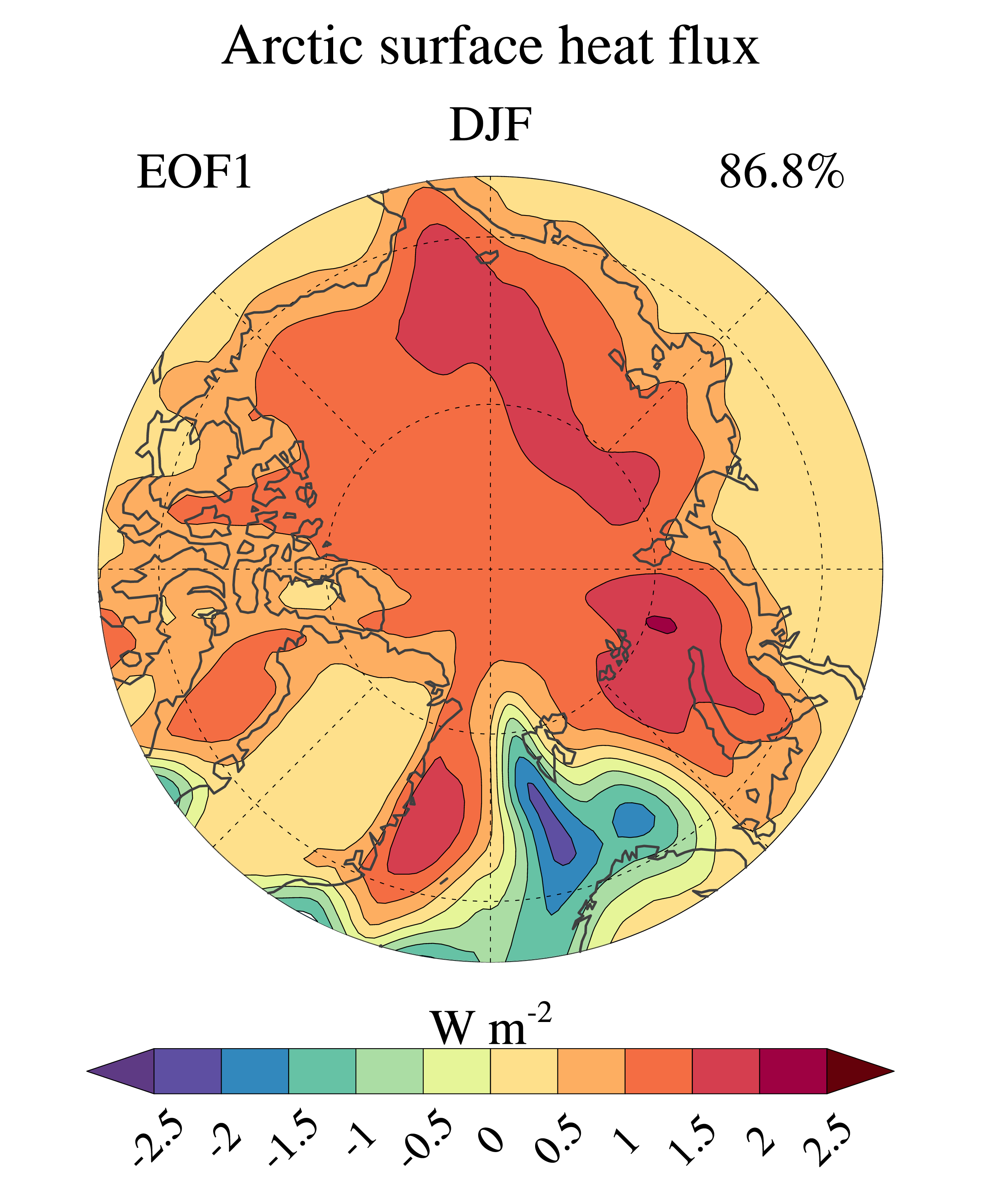
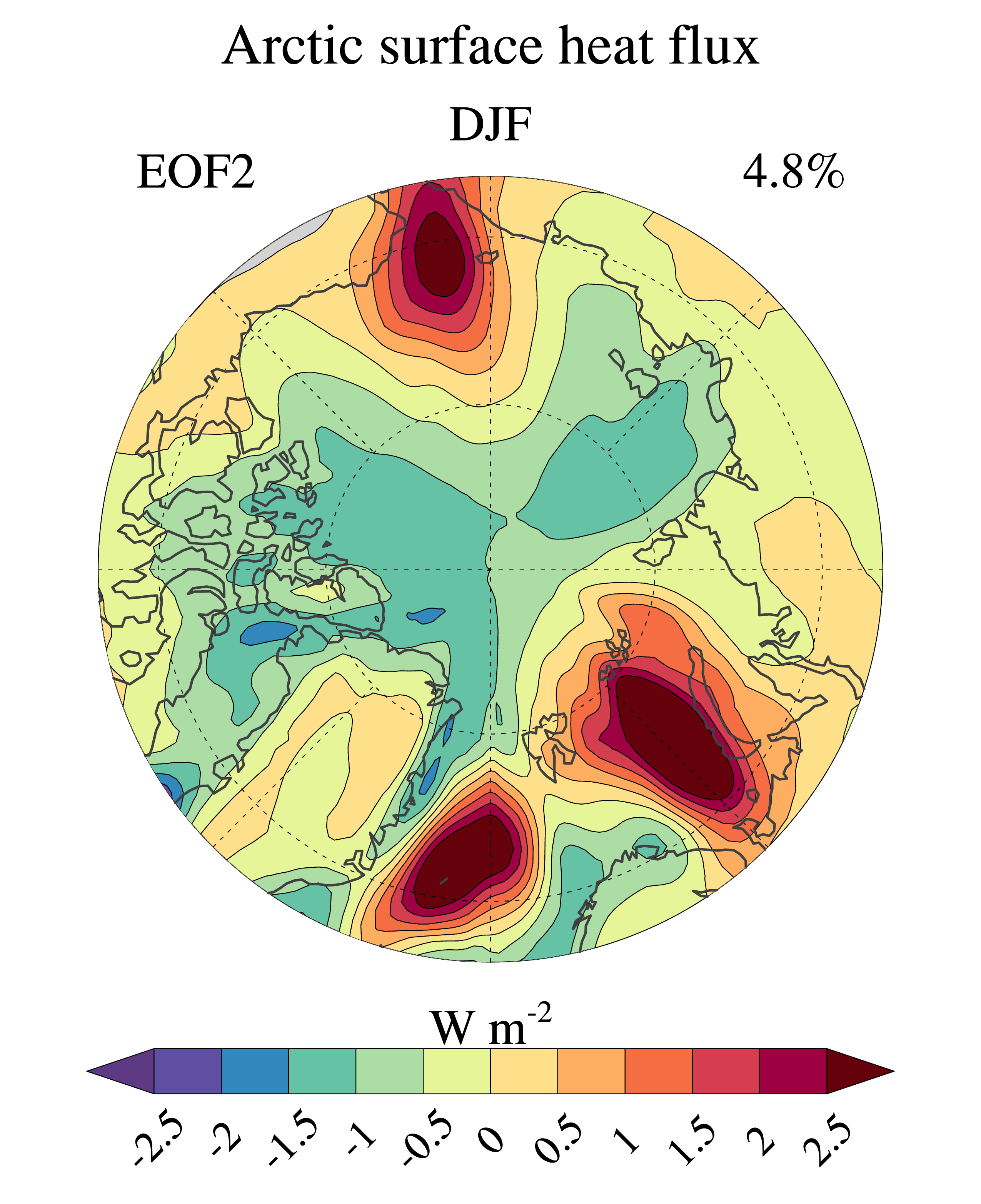
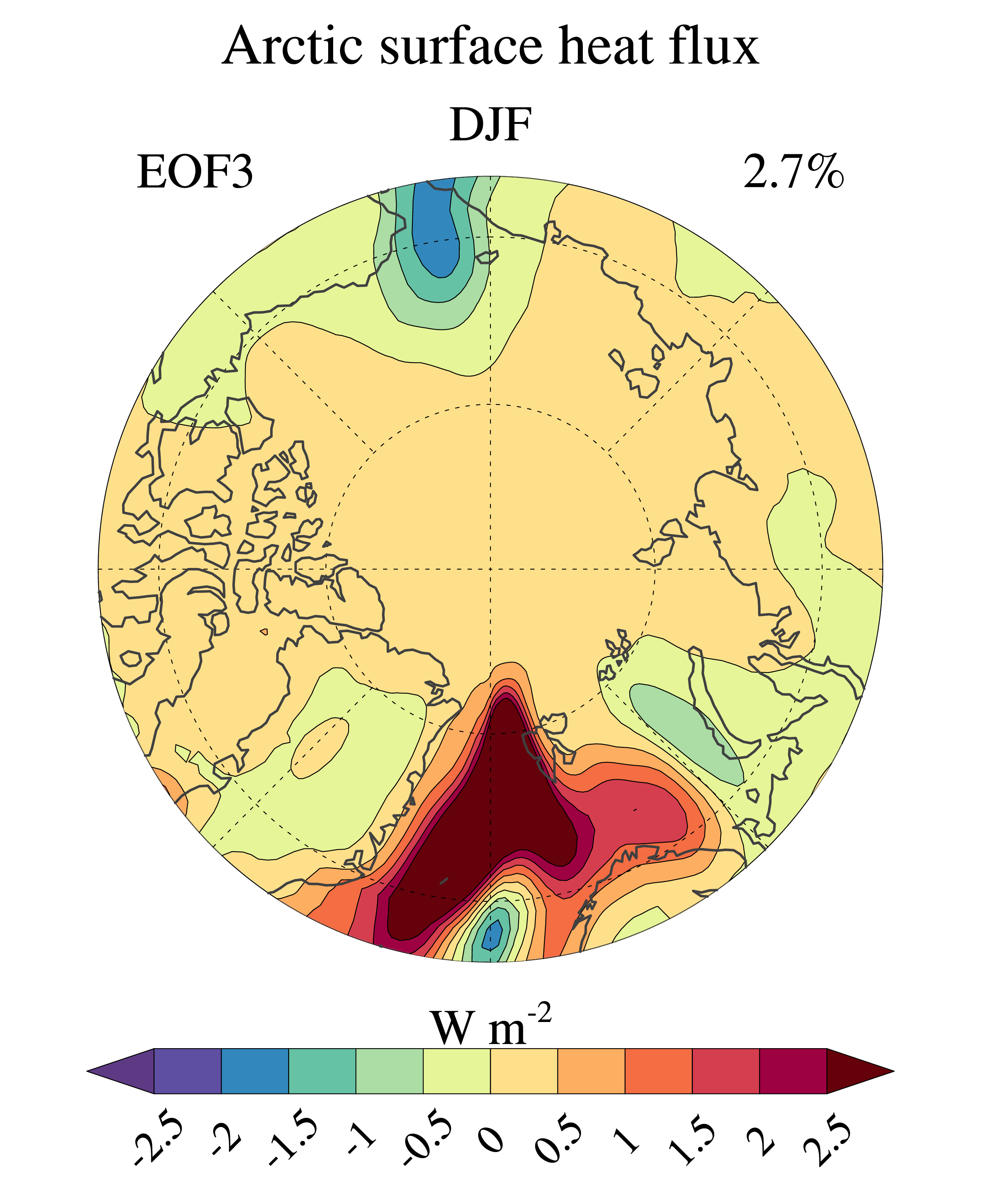
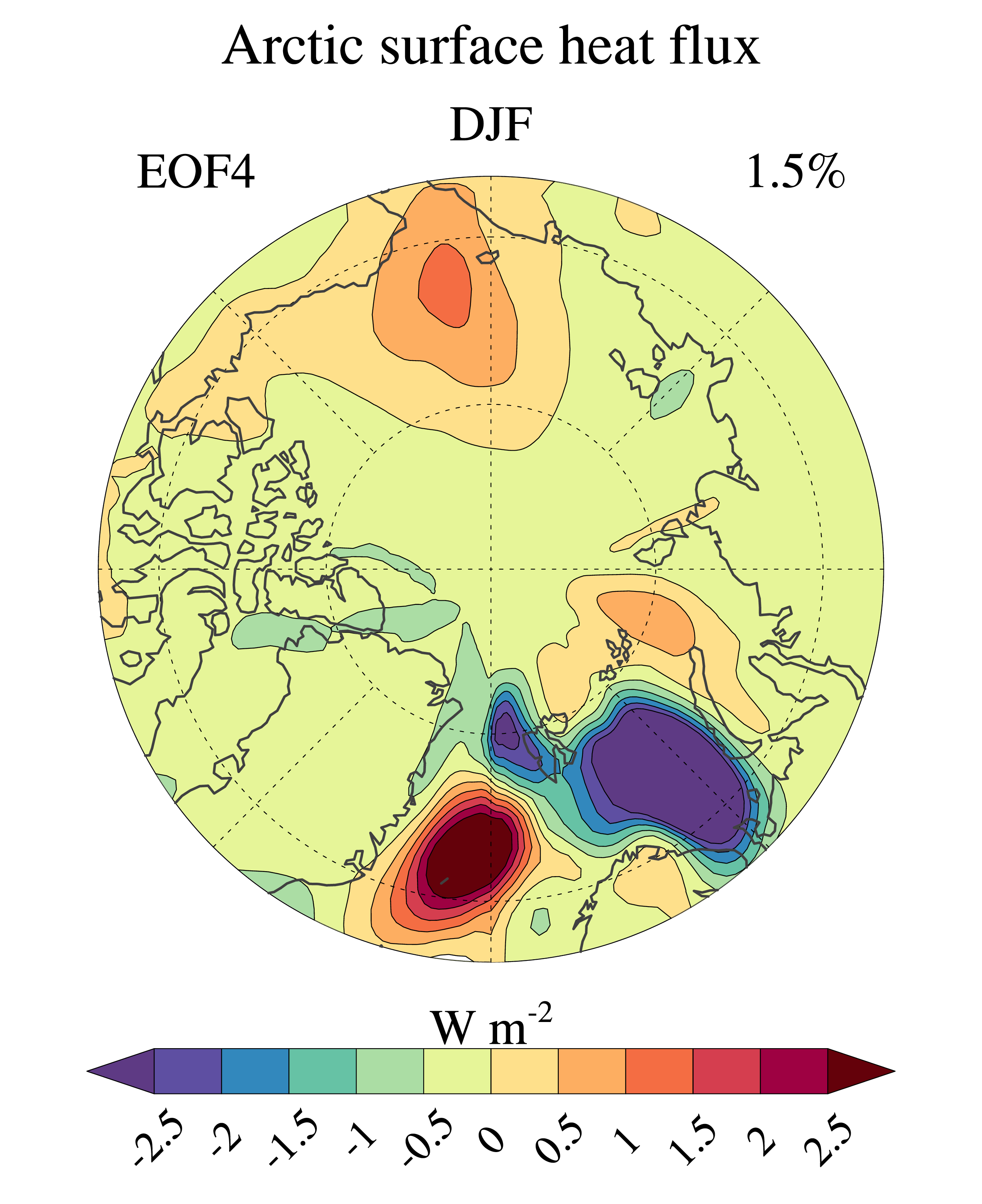
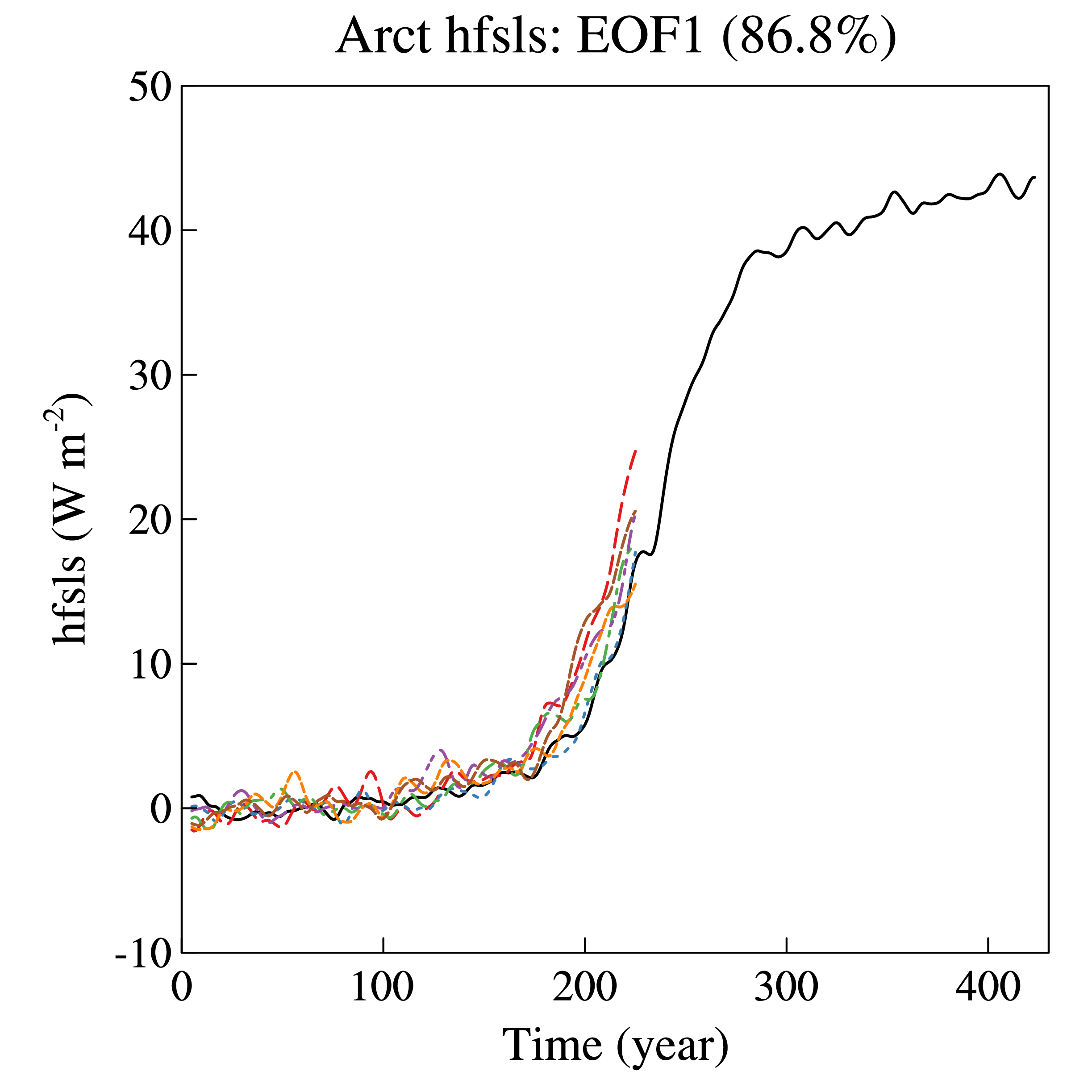
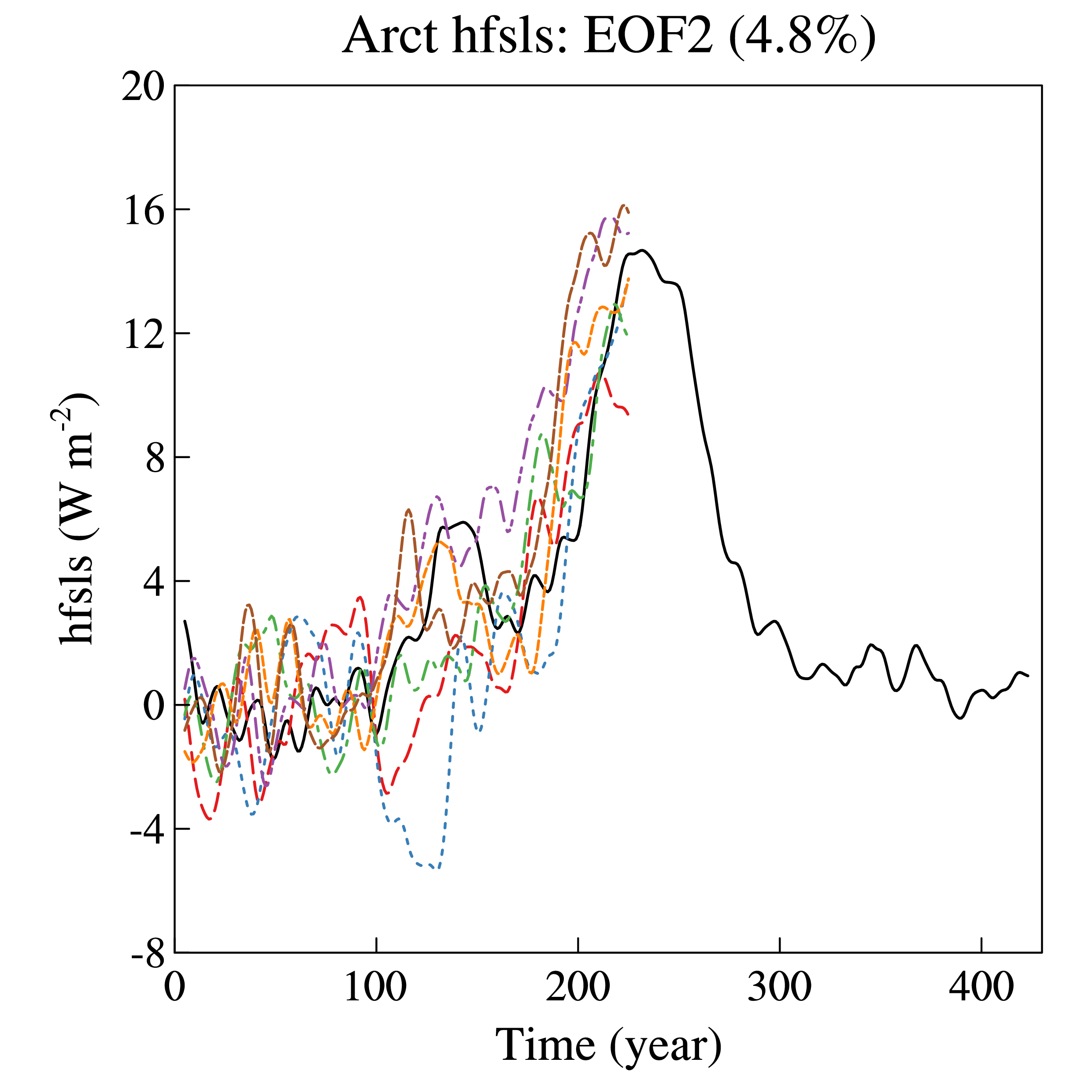
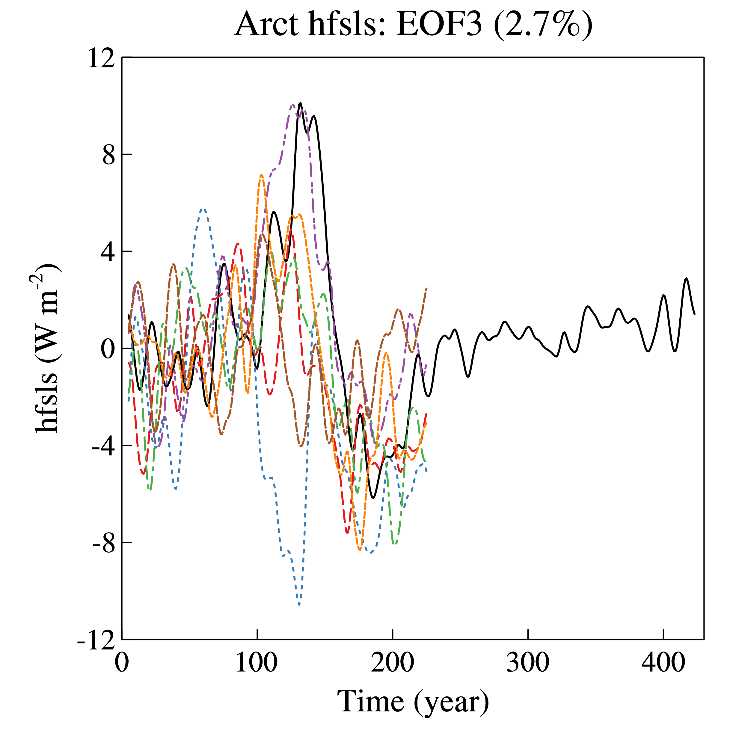
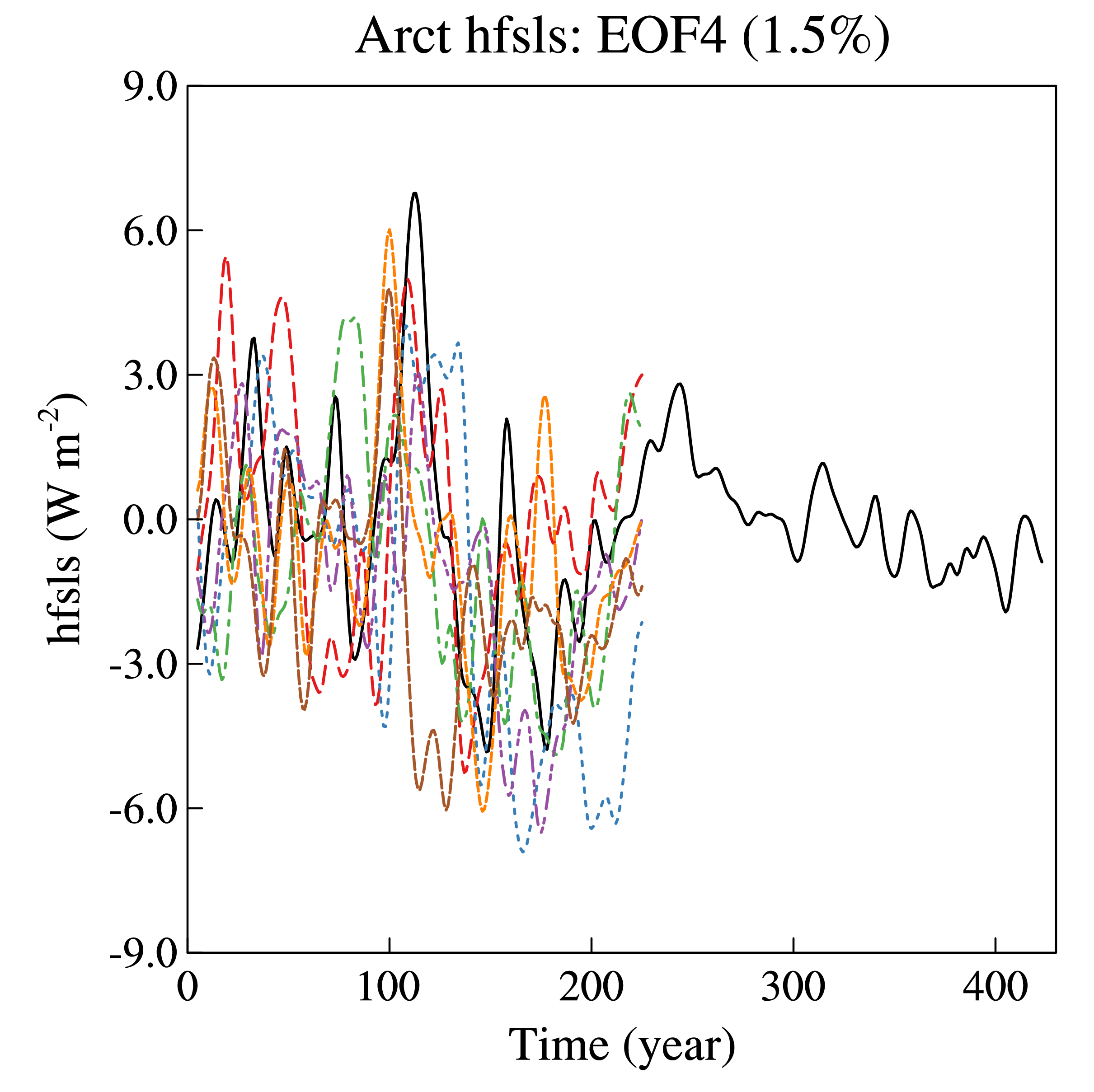
Each figure shows the pattern and time series of the first four EOFS: EOF1 (upper left), EOF2 (upper right), EOF3 (bottom left), and EOF4 (bottom right). The pattern is shown for the baseline experiments. The time series are shown both for the baseline (black) and for the different KeyCLIM experiments (red). For the time series, the trends for the last 100 years (2001-2100) are shown as the sloping stragiht lines.
The values above the maps show the fraction of explained variance for the respective patterns, computed across the entire time-series from the baseline. The values above the time-series indicate the percentage change in the explained variance for the KeyCLIM experiment (red) versus the control (black) and the the ratio between the trend and the standard deviation of the first 100 years of the historical.
