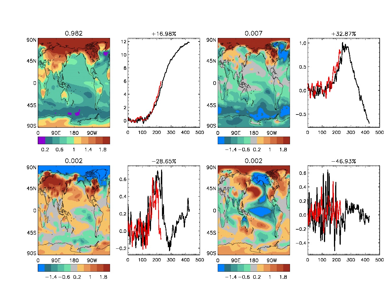
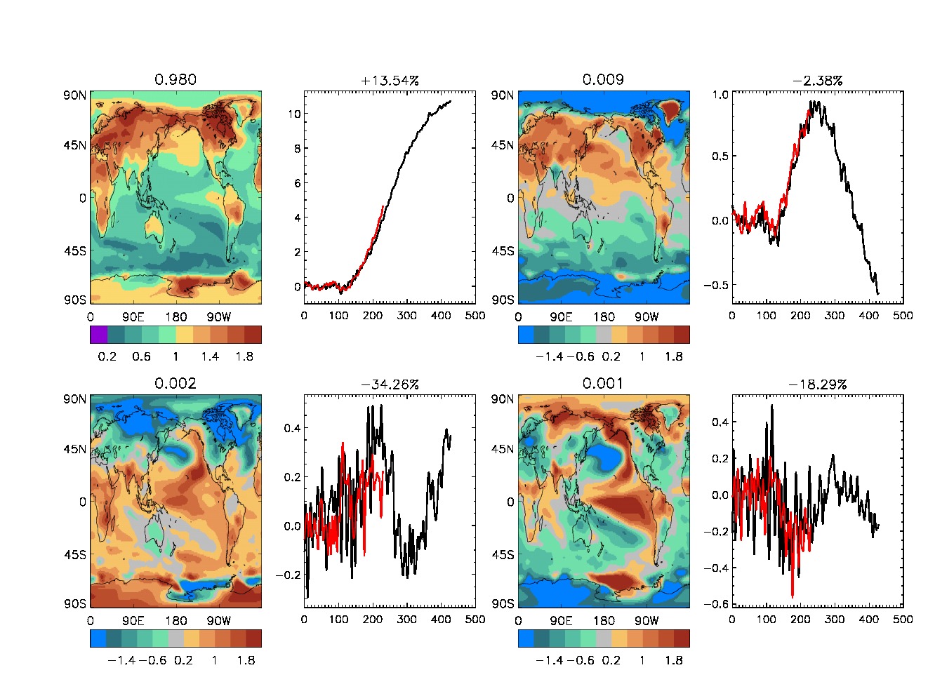
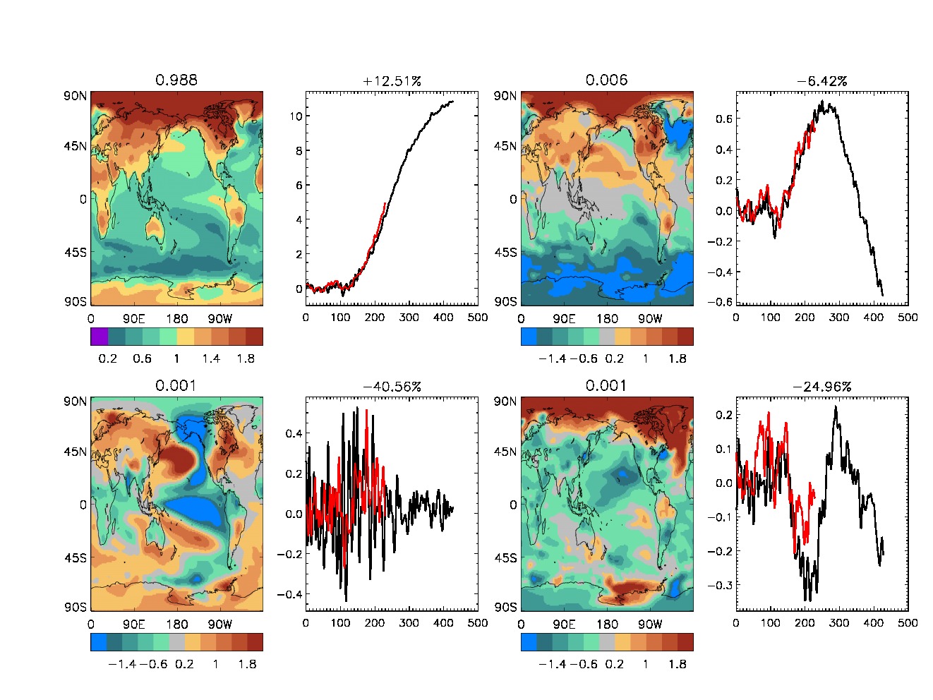
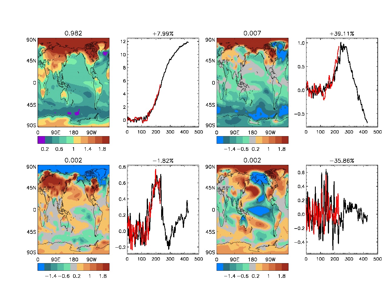
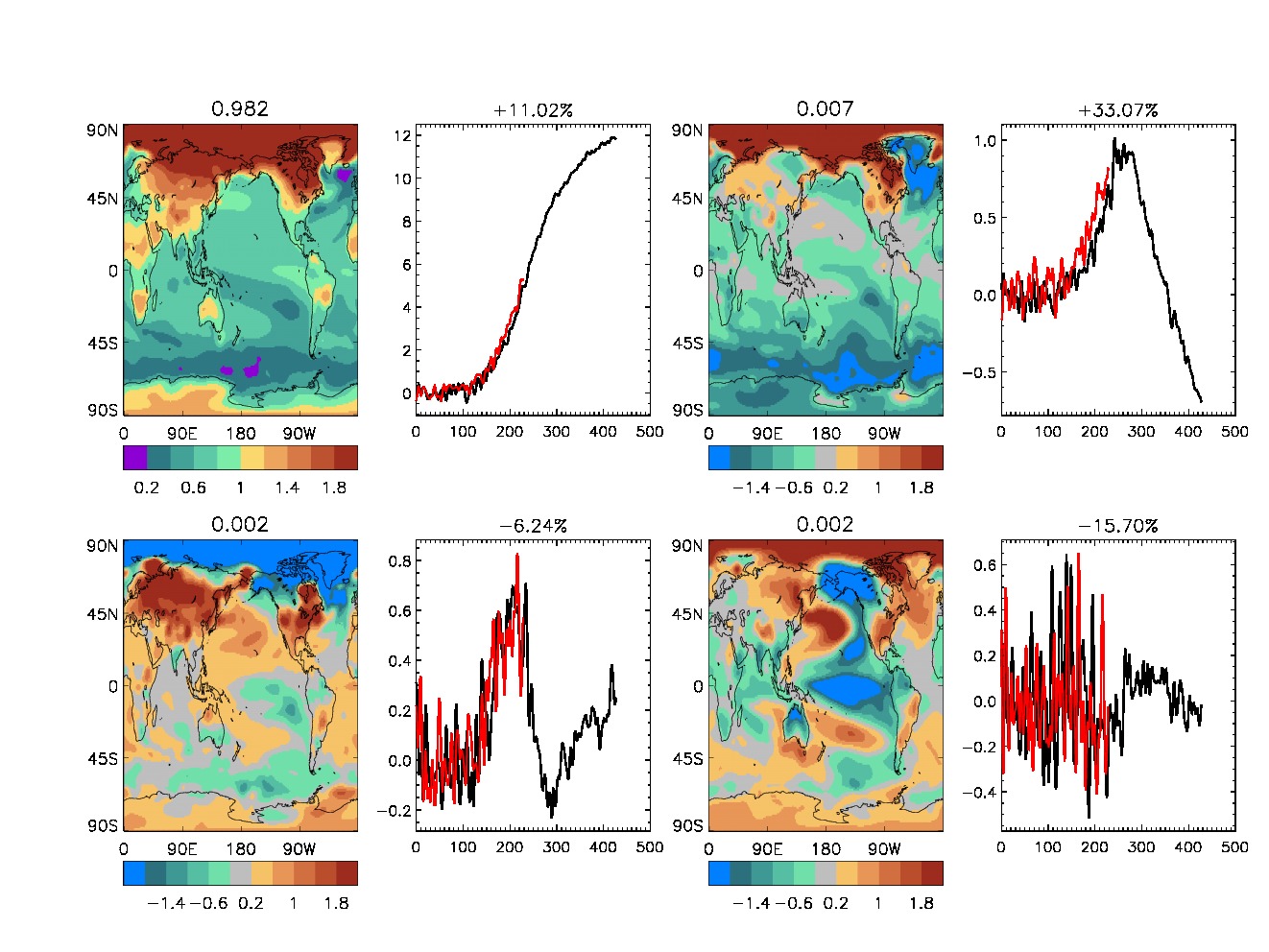
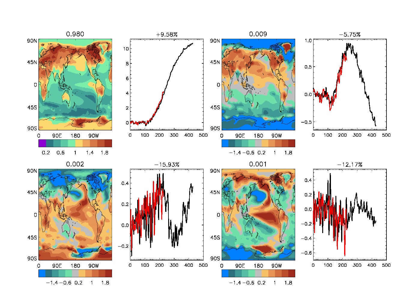
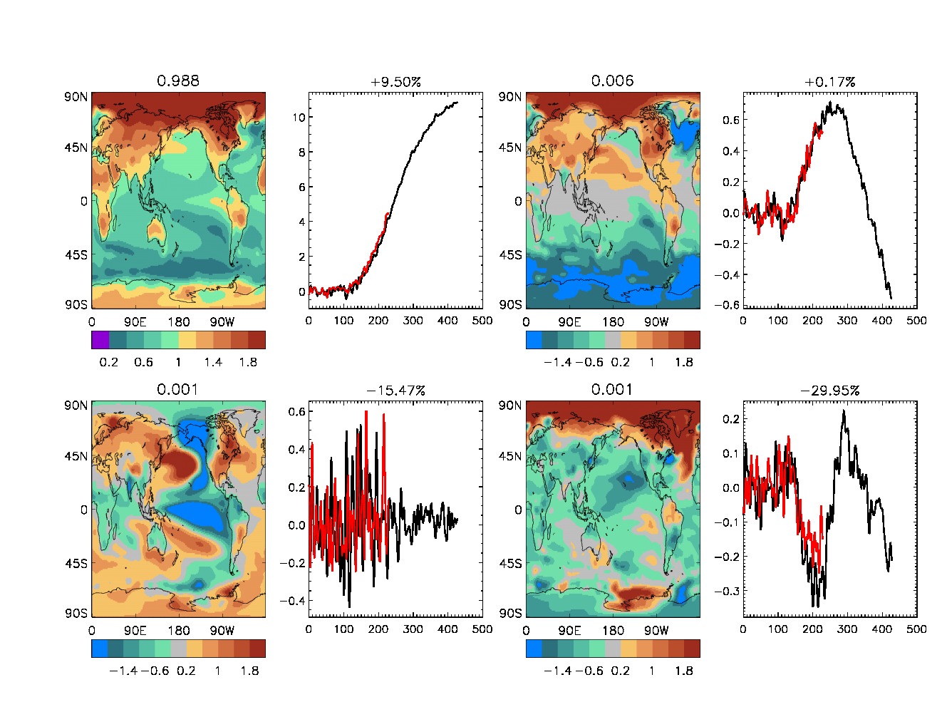
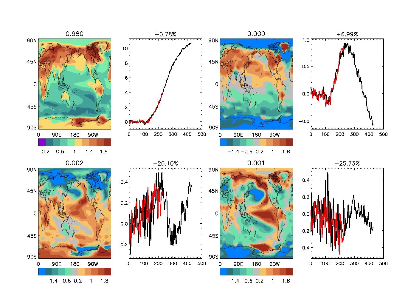
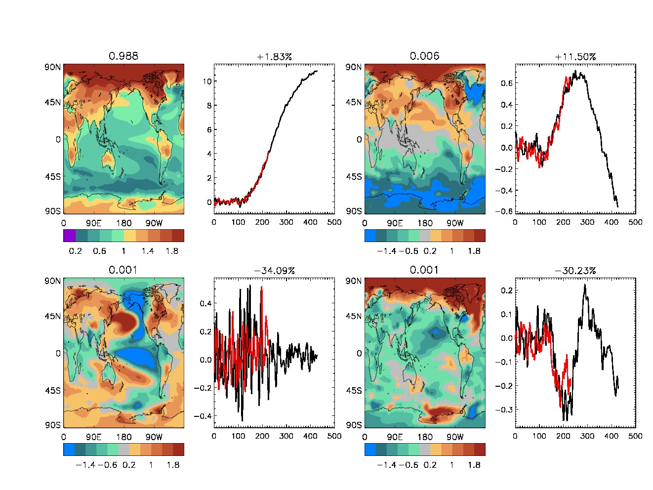
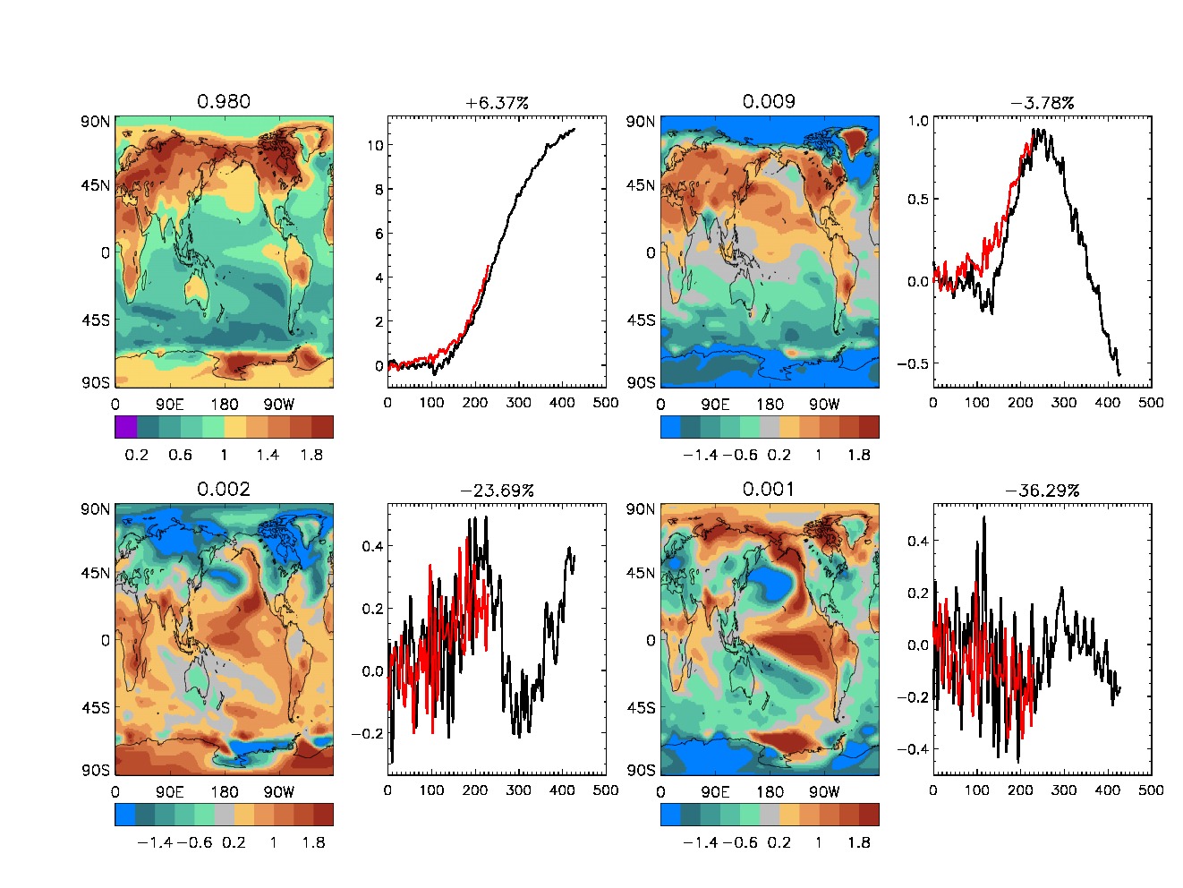
Emprical orthogonal functions (EOFs) based on near-surface temperature
for the CMIP6 baseline experiments (historical + ssp585) and the
various modified KeyCLIM experiments (hist-* + ssp585-*).
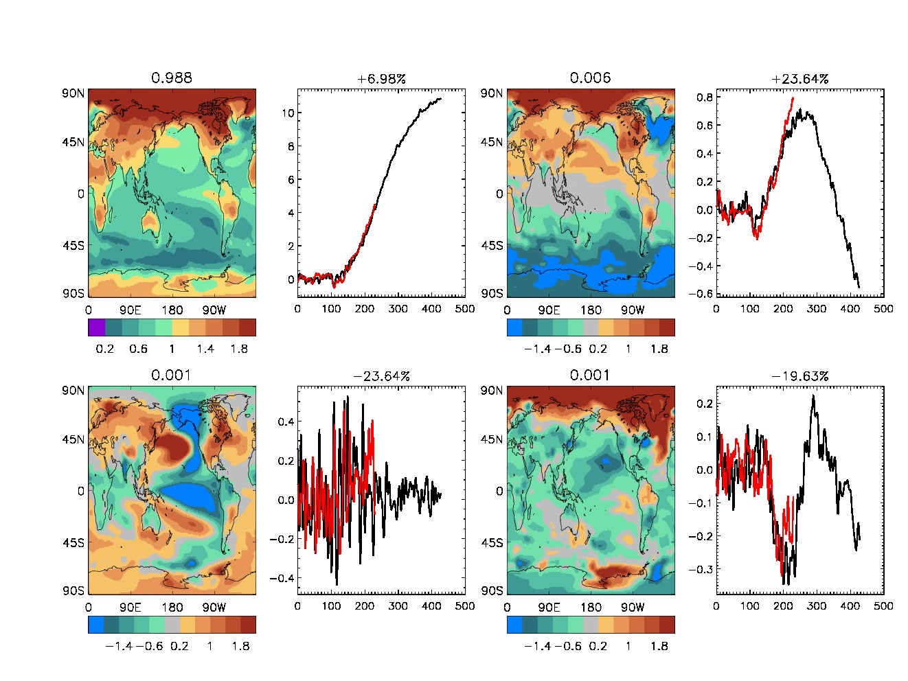
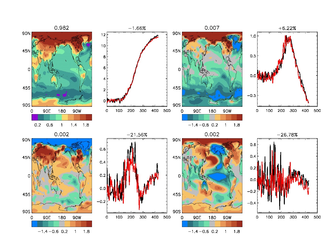
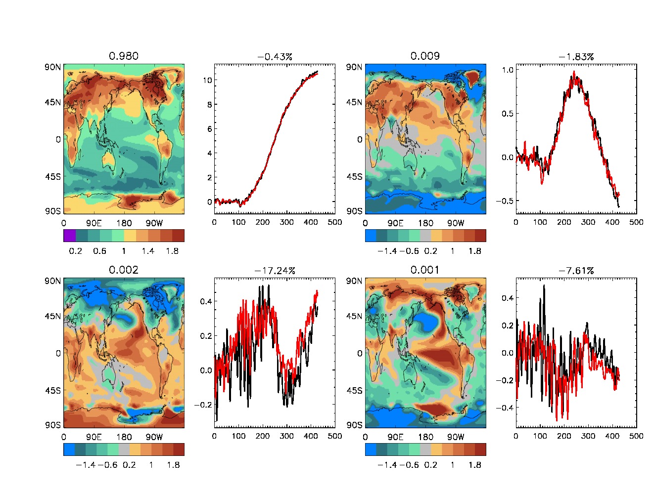
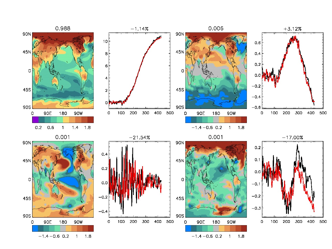
Each figure shows the pattern and time series of the first four EOFS:
EOF1 (upper left), EOF2 (upper right), EOF3 (bottom left), and EOF4
(bottom right). The pattern is shown for the baseline experiments. The
time series are shown both for the baseline (black) and for the
different KeyCLIM experiments (red).
The values above the maps show the fraction of explained variance for
the respective patterns, computed across the entire time-series from
the baseline. The values above the time-series indicate the percentage
change in the explained variance for the KeyCLIM experiment (red)
versus the control (black).
